Member-only story
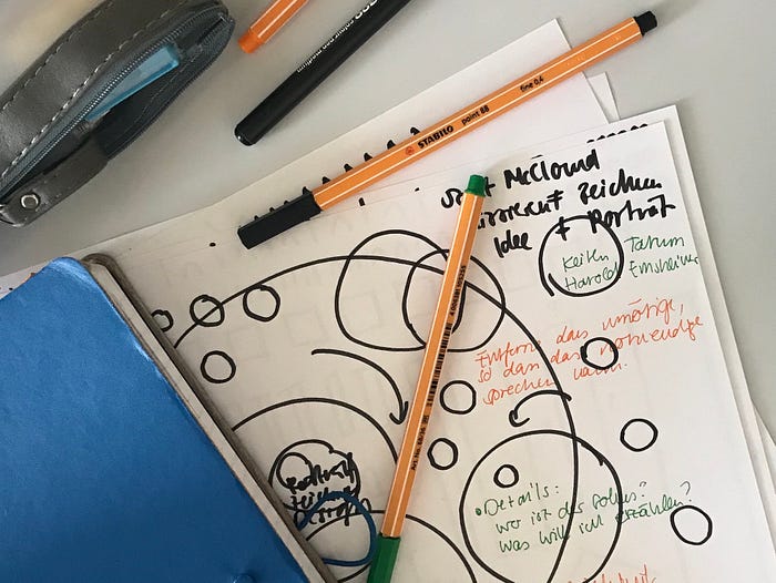
Drawing the Data Interface
A look at using pen and paper to design innovative data visualization interfaces

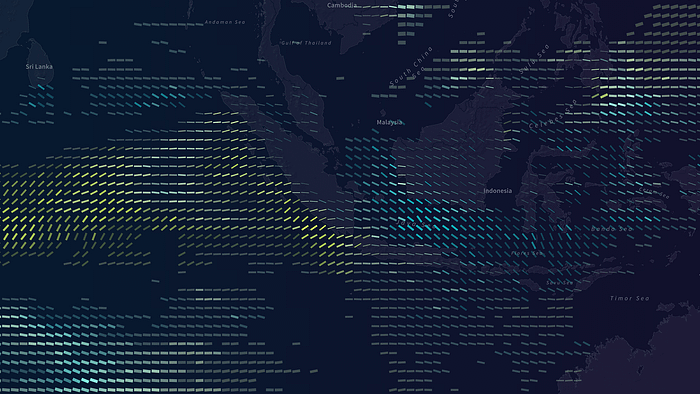
 Data visualization is one of the most exciting and experimental areas in digital design. Creating complex, meaningful, and visually intriguing images is a formidable challenge for every designer. By applying strategies from information design and generative design, it is possible to create data-driven visualizations that are both insightful and enticing. The work of designers like Moritz Stefaner, Nadieh Bremer, Kim Albrecht, and Stefanie Posavec (and many others) demonstrate the power of design-driven data visualizations.

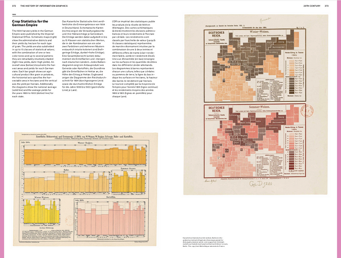
A common critique of design-driven data visualizations is that the designer places themself between the image and its significance, suggesting that the design influences the way we interpret the data. However, as I have pointed out before, every form of visual representation — even the most boring bar chart — is a manifestation of cultural image production. Data visualizations are always cultural images. There are no “pure” forms of data visualizations, just more common and less common ones. If you look at the history of information visualization (I highly recommend The History of Information Graphics by Sandra Rendgen), you will find an impressive richness and variety of visual representations. Translating data into images has always been a cultural activity, not a technical one. Like it or not, it is impossible to remove design from a visualization.

There is, however, one tendency in data-driven visualizations that I find slightly problematic, and that is the general neglect of the interface and the interaction design.
My impression is that there is currently a very strong focus on the visual quality of the visualization while the interface that controls the visualization receives much less attention. This is often due to a lack of resources. But it is not something I am entirely happy with.
